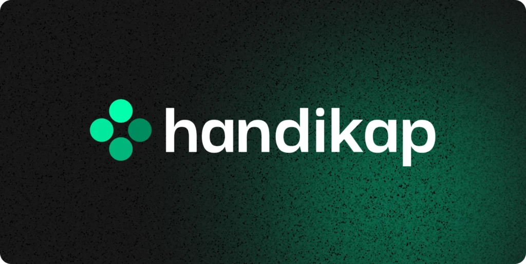
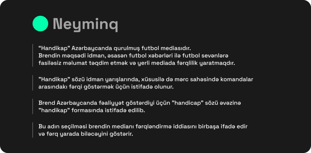
For the new Azerbaijan-based football media “Handikap,” our branding needed to reflect sports culture while also showing its goal of standing out in the local media industry.
The first two weeks of our branding service focused on research. Out of several options, we chose “Handikap,” a word linked to sports and competition, especially in betting, where it means creating a difference between rivals.
To better fit the local audience, we made a small adjustment and wrote it as “handikap.”This reflects the brand’s main idea: making a difference.
The visual identity is built around a main symbol made of 4 circles in the shape of a “+”:
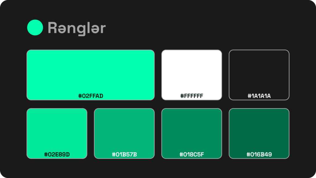
The “Handikap” brand is built on different shades of green — and the choice is no coincidence.
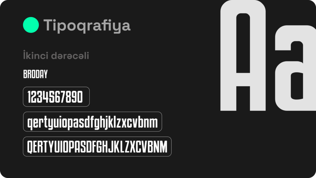
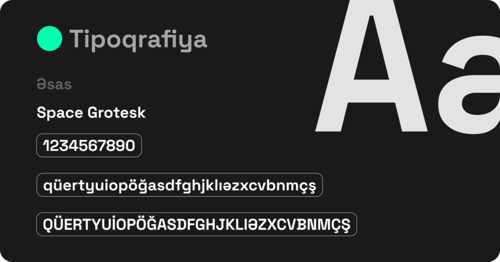
The fonts used in the brand’s visual identity were carefully chosen to express its character and deliver its message more clearly.
“Space Grotesk” is a modern and functional sans-serif font. It ensures high readability while reflecting the brand’s technological and innovative side through a contemporary design aesthetic. It is mainly used for headings, information sections, and body text.
“Broadway” is a strong sans-serif font with more character, a unique look, and a style well-suited to the world of sports. It is mainly used in highlighted elements, campaign titles, and areas where the brand’s emotional side needs to stand out.