After creating the visual identity for “Handikap,” the next stage of the project was the UI design process.
“Handikap” is a football-focused news platform aimed at the Azerbaijani market. Its goal is to deliver both local and international football news with fresh, analytical, and visually distinct content.
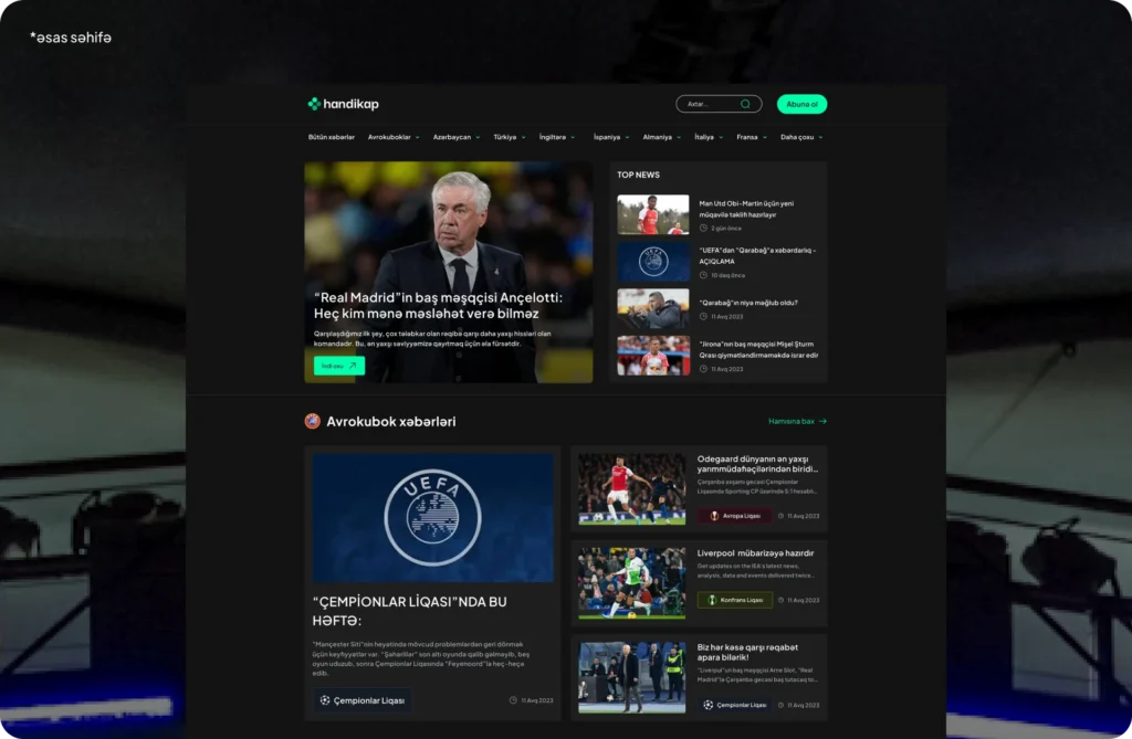
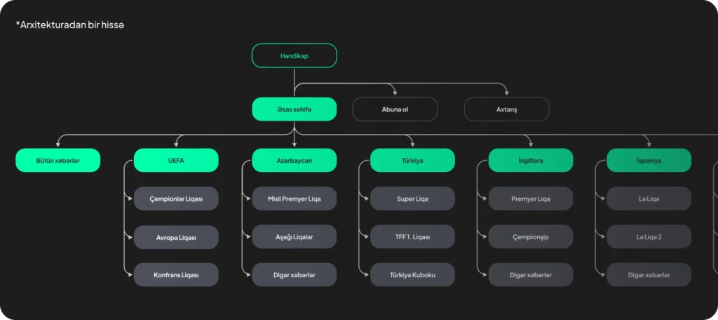
In the UI design process, the main goal was to structure the site so football fans could easily find news in an intuitive way, while presenting the content in a clear, logical system.
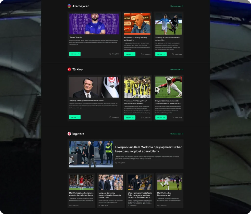
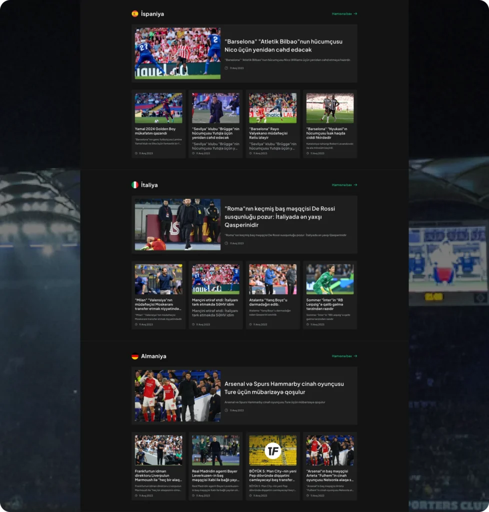
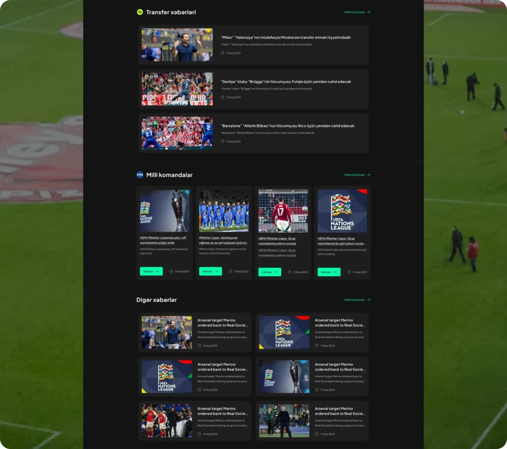
The architecture organizes news by leagues and tournaments, allowing users to quickly access the matches, leagues, and countries they care about with just a few clicks.
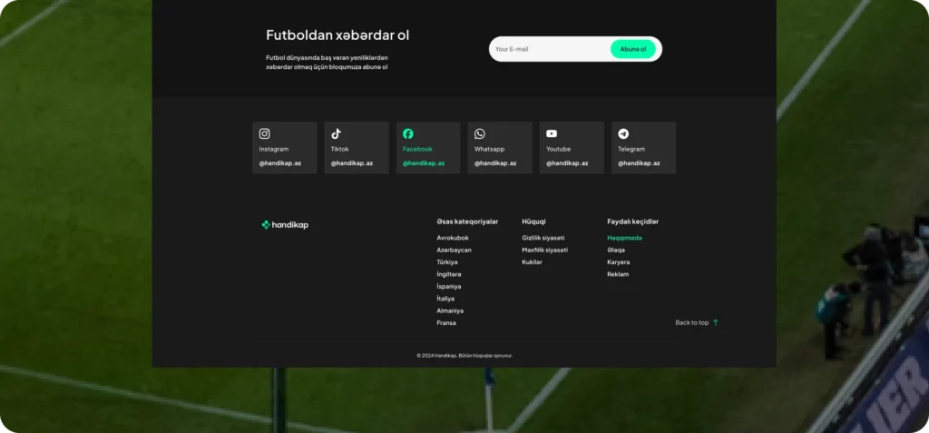
From the homepage, users can navigate through UEFA tournaments, top national leagues (Azerbaijan, Turkey, England, Spain, etc.), and their sub-leagues (Premier League, La Liga 2, etc.) in a clear hierarchy. Features like “subscribe” and “search” were also integrated into the navigation.
This simple and well-structured system not only makes the experience smoother for users but also helps present content in a more organized way.
In line with the “Handikap” branding, the main color chosen for the web design was a vibrant aqua green. This color creates a visual atmosphere that feels both energetic and modern.
For backgrounds and typography, dark gray and black tones were used to maintain visual balance and improve content readability.
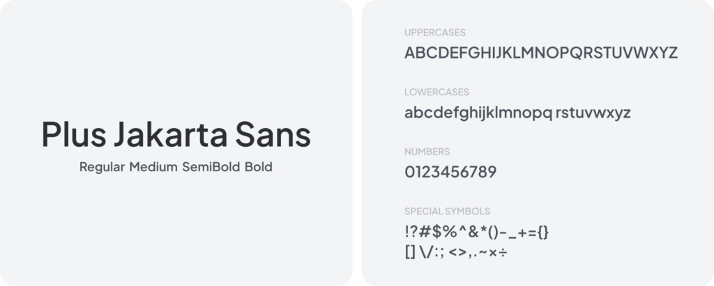
The main font chosen for the project is “Plus Jakarta Sans“. Its modern and functional look fits well with Handikap’s tech-driven and sports-focused identity.
The variety of styles within the font family allows it to be used for both headings and long text blocks, creating balance and readability across the design.
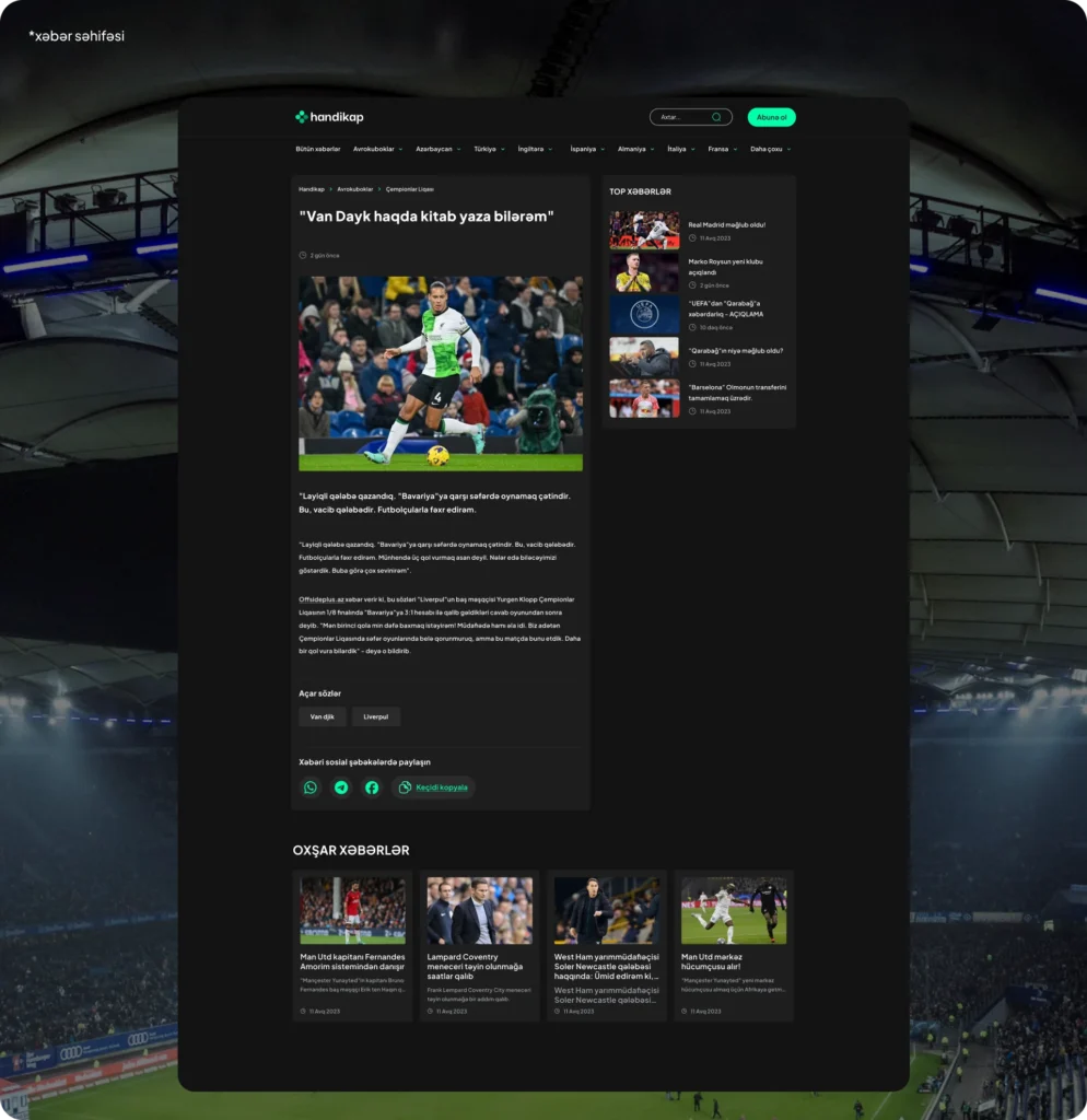
Here are a few key parts of the interface we created for “Handikap.”